JULIE VALENTINE
Styling | Graphic Design | Creative Direction
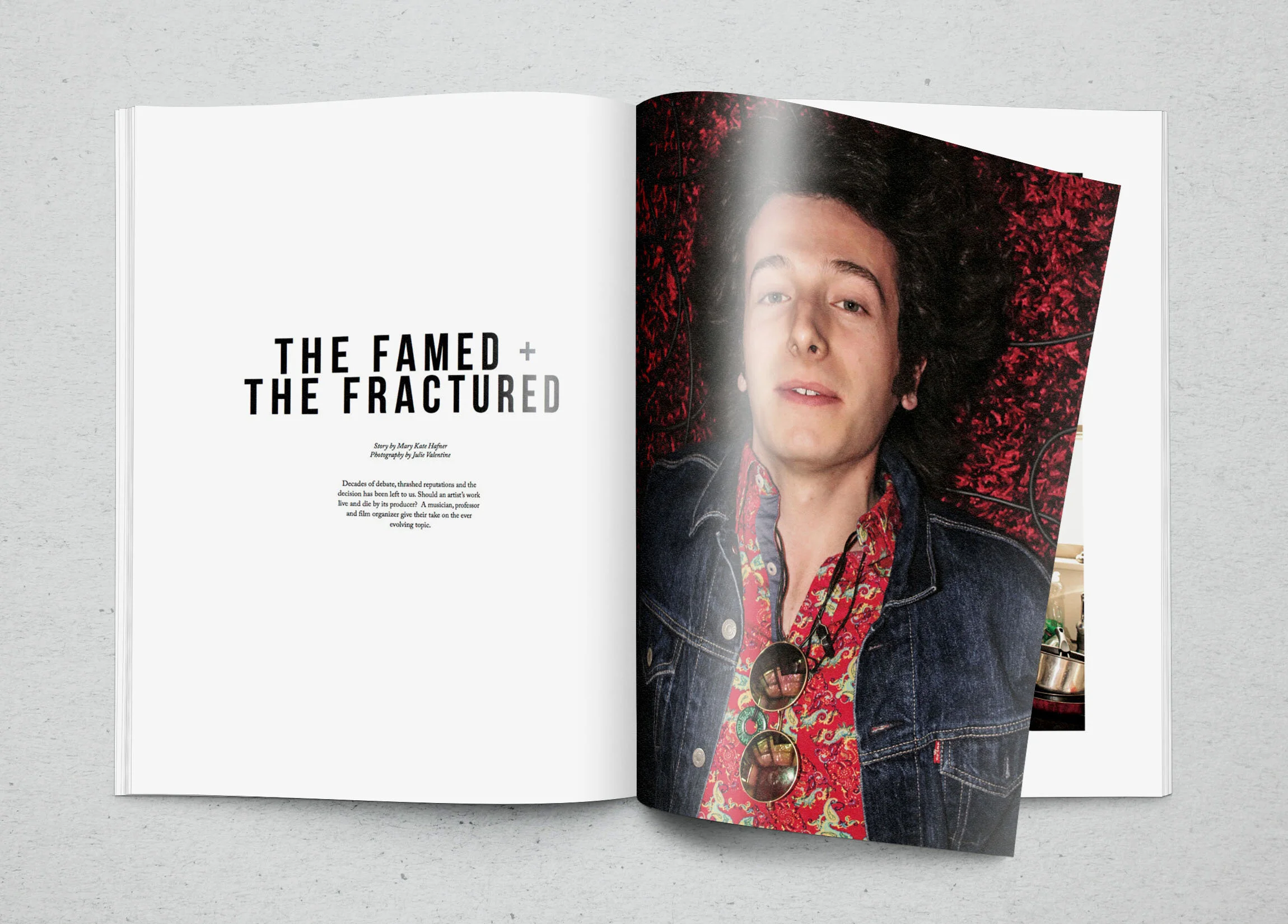
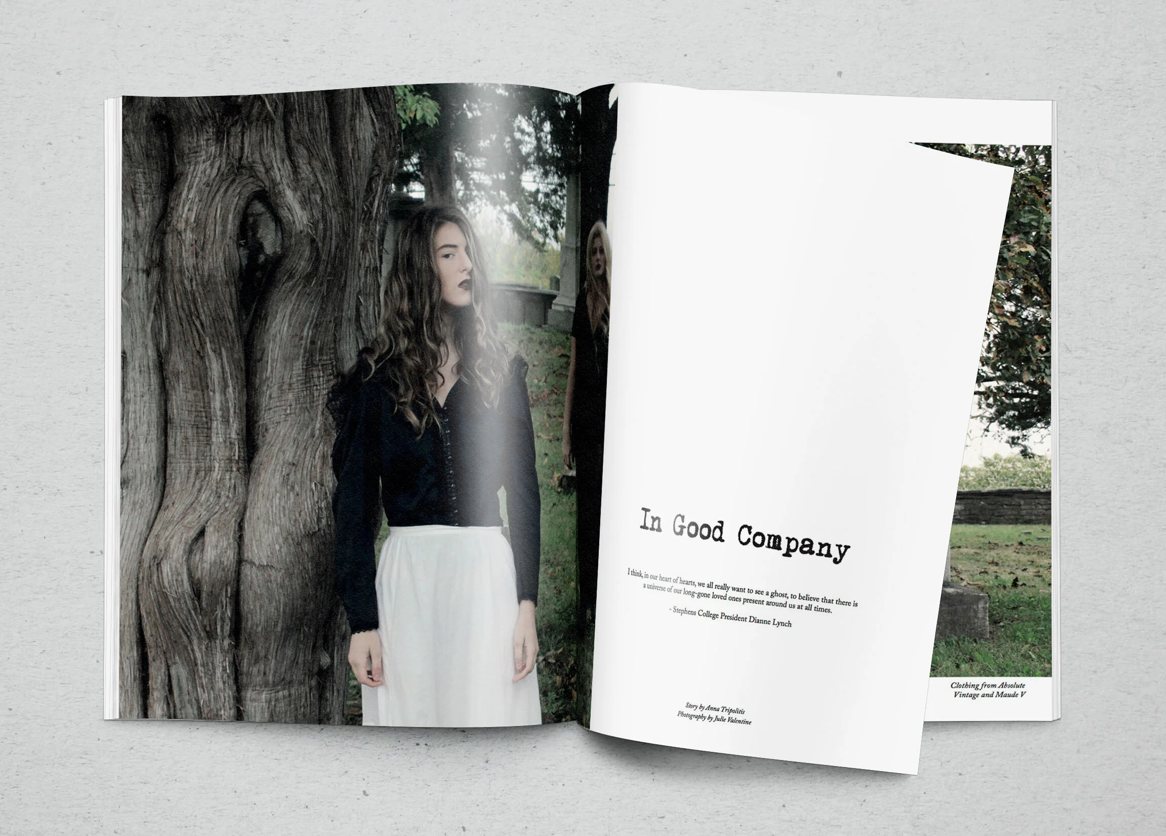
As art director of Stephens Life Magazine for the Fall 2016 issue, I was incharge of overseeing creative content and that it was being executed to be cohesive with the branding of the magazine. While I over saw every spread and reviewed all design aspects, I designed two editorial layouts that were published in the issue; The Famed + The Fractured and In Good Company.
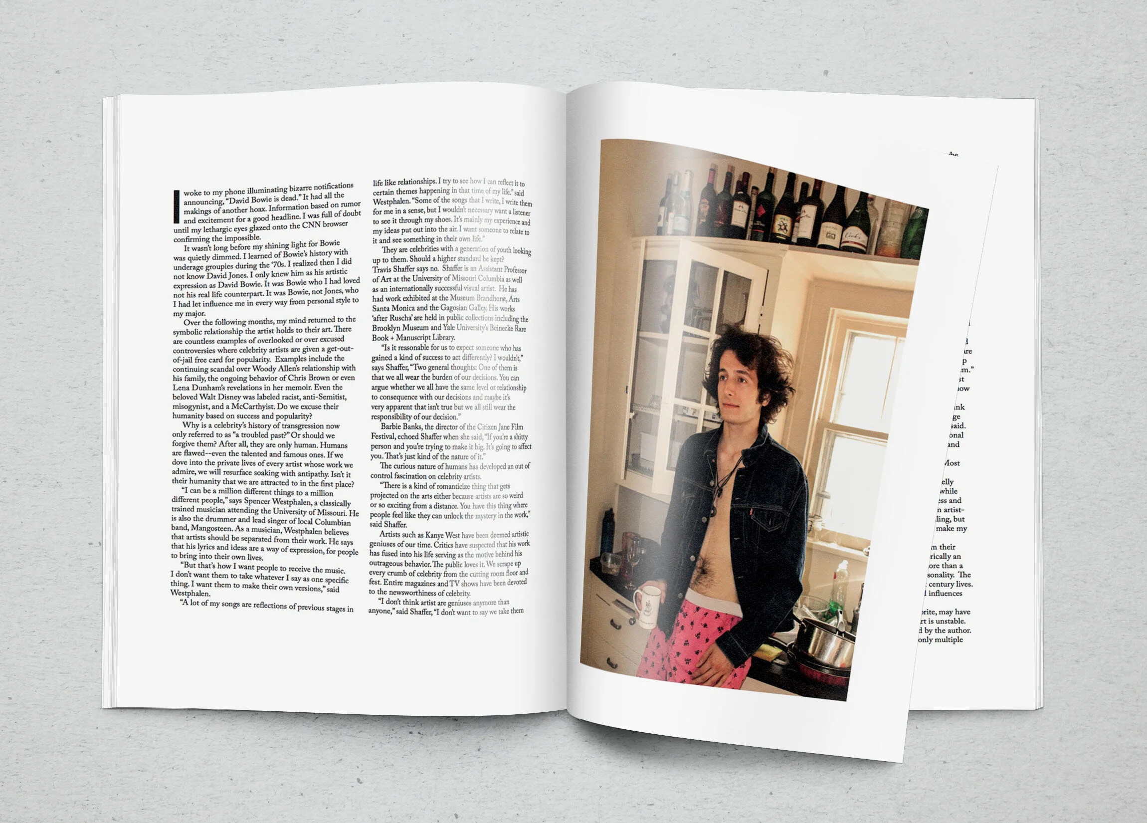
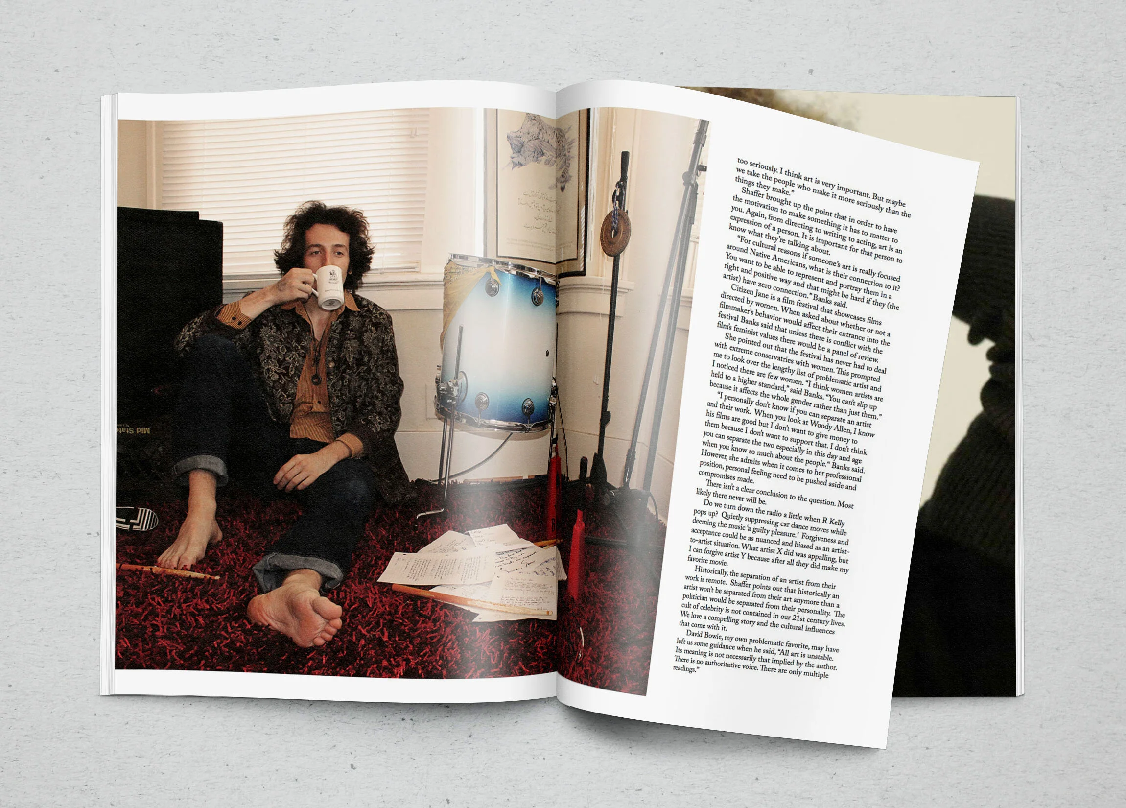
While designing the layouts, the most important thing was to keep the branding of the magazine in mind. Stephens Life focuses a lot on minimalism and white space. The publication puts a lot of focus on the photography and the stories, using the white space to seperate the two aspects of the magazine.